Photo by Ava Tyler from Unsplash
PULLMAN, Wash. — It’s hardly a secret that smart eating choices can lead to numerous health benefits, but while visiting a restaurant, many people can’t help but indulge in calorie-heavy meals. Researchers from Washington State University, however, indicate restaurants can persuade patrons to opt for healthier options by simply adjusting the font size of numbers attached to nutritional information on menus.
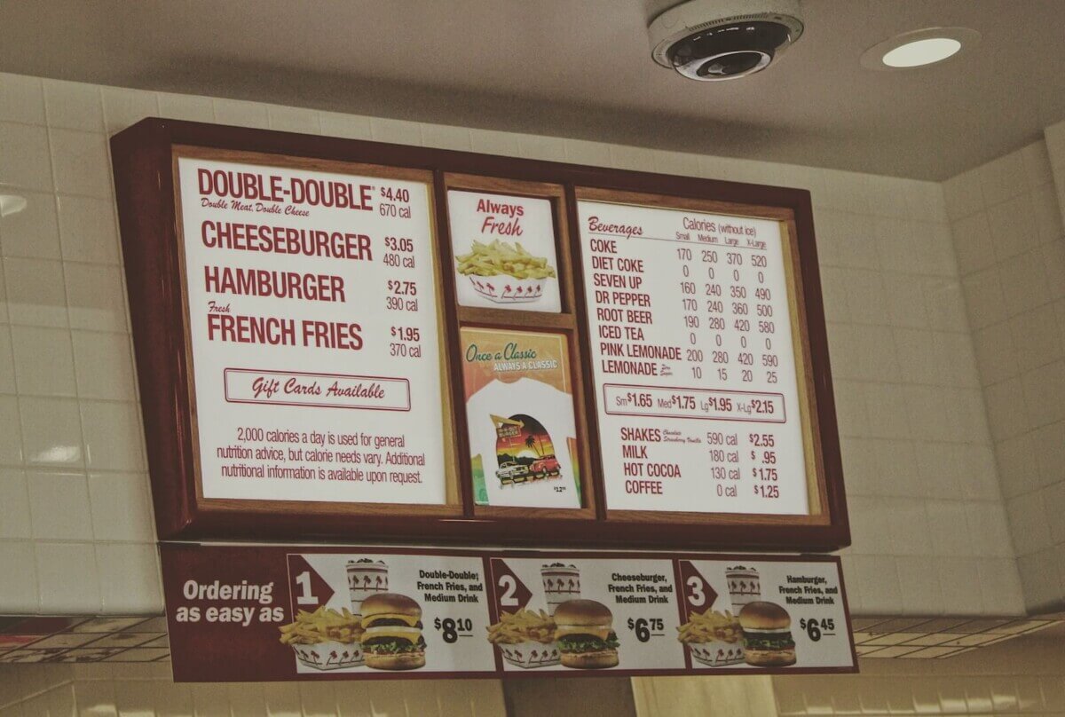
Lead researcher Ruiying Cai, an assistant professor at the WSU School of Hospitality Business Management, explains that all U.S. restaurants with more than 20 locations are already required to show the calorie content of their food on menus. By adopting a strategy of representing these values incongruously (using physically larger numbers on the page when they’re attached to lower-calorie options), Prof. Cai believes restaurant businesses can successfully “nudge” customers toward healthier dietary choices.
“When restaurants use a larger font size for the calorie content of healthy foods, even though the number itself has a smaller value, it will increase consumers’ preference to order the healthier item,” Prof. Cai says in a university release.
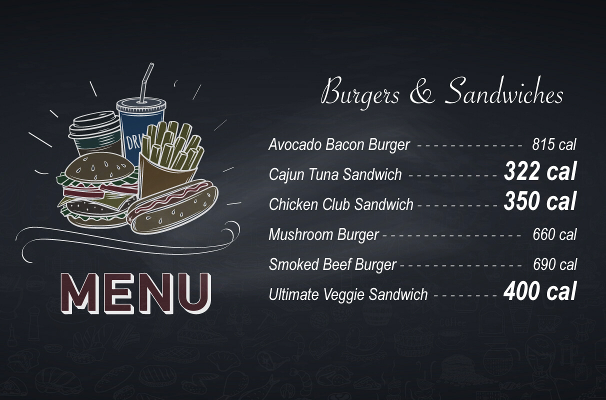
During this study, participants had to choose between a less healthy item like a smoked beef burger and a healthier option like a grilled chicken sandwich. Then, researchers randomly assigned them to two groups. For the first cohort, number values and font size increased and decreased together. For the second group, the relationship between the numbers’ magnitude and their size was incongruent; in other words, the font size became smaller as the number values rose and vice versa.
Study authors also posed a number of questions aimed at gauging how health-conscious participants were, all while providing varying time limits to some participants in an effort to measure the effect time constraints may have on their decisions. Prof. Cai notes the results showed participants in the second cohort, who saw low-calorie counts printed in large fonts, were more likely to go for the healthier option. Those who indicated they were less health-conscious were also the most affected, especially when given a tight timeframe to make the choice.
Eaters who had a high level of health awareness were less likely to be swayed, Prof. Cai says, adding this is likely because they already favored healthy food.
“Even if you use some of the smart tricks, it does not work as well as for those who are not so knowledgeable about health,” Prof. Cai comments.
This research leveraged a phenomenon called the “numerical Stroop effect,” which uses incongruity to emphasize lower numbers and slightly slow the decision-making process, consequently helping to coax customers toward healthier menu options.
In its traditional form, the Stroop effect is described as a delay in reaction time related to stimuli. For instance, if the word “purple” is written in green font, it usually takes people a bit longer to call out which color they’re seeing than if the word and the color match up. Clinicians have used this principle to measure attention capacity and processing speed among patients. Similarly, the numerical Stroop effect can be seen when the physical size of a number does not match its actual magnitude, like when the number 50 is in a larger font than the number 80.
Restaurants should be invested in encouraging patrons to make healthier choices, Prof. Cai says. However, simply labeling the food as healthy may not be enough.
“Healthy food items could be profitable for restaurants, but whenever a ‘healthy’ label is attached, people may assume it does not taste good,” Cai concludes. “We’re trying to provide restaurants with subtle cues, rather than saying it out loud.”
The study is published in the International Journal of Hospitality Management.


I’d settle to just be able to read the menus they give out.
What is with the incredibly small fonts they seem to use everywhere.
Food product ingredient lists, nutritional facts, instruction booklets, phone apps, etc.
Do they screw us over on purpose?